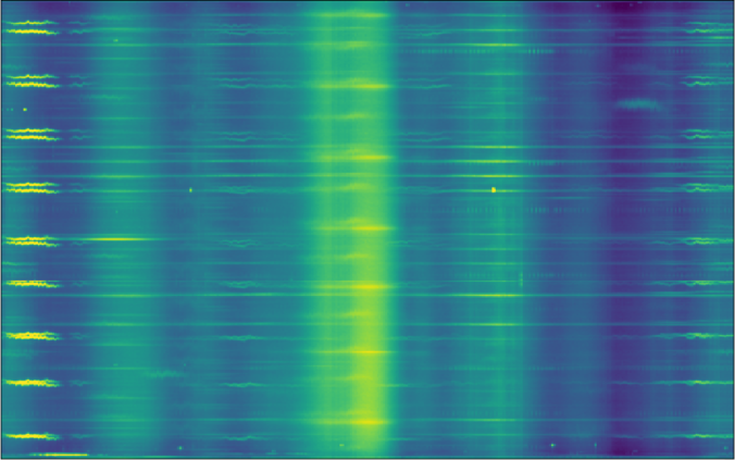
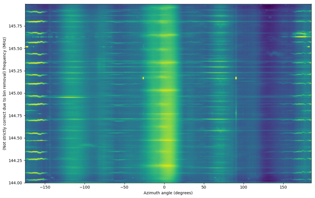
The scripts we developed during the spring and summer for measuring and plotting the reception pattern of an antenna turned out to have additional applications: They can be used to give an overview over the frequency space in our surroundings! We used these to find what kind of noise and signal sources we have around us at the 2m band, by turning around the 2m array while saving IQ samples from our USRP at a high sample rate. As explained in an earlier post, a high sample rate can be directly translated to a broad spectral range in the frequency domain. Using these azimuth-resolved, broadbanded data, we could visualize the signal contributions at various frequencies from the different azimuth directions as a waterfall image.
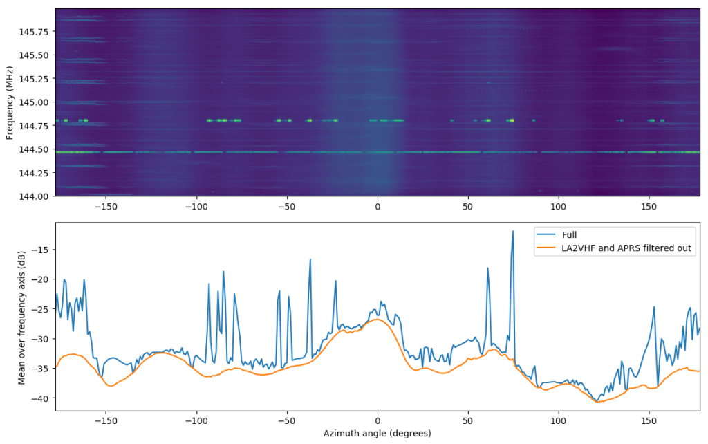
Here, a center frequency of 145 MHz was used along with a sample rate of 2 MHz, yielding a frequency range from 144 MHz to 146 MHz. This well visualizes the relevant frequency range in the 2m band. The below plot shows the integrated frequency values for each direction, which estimates the energy in each azimuth direction.
One major challenge in visualizing such results is the large amounts of data. A full turn of the 2m array rotor takes 4 minutes, which with this samplerate generates a total data amount of 480 million samples, or 3840 MB of complex IQ data. If we take the fast fourier transform over this with length n_fft = 512, we’d get a waterfall diagram with only 512 pixels along the frequency axis, but 937500 pixels along the azimuth axis. This gets a bit excessive! Luckily, we can throw away some of these data. 937500 pixels along the azimuth axis means that the azimuth resolution is very fine-grained here, but we’ll probably not see much difference in spectral behavior from azimuth direction 50.001 to azimuth direction 50.002. We therefore converted the FFT time axis to an azimuth degrees axis, and rounded off azimuth degrees to the closest whole number. All time steps in the FFT corresponding to the same rounded azimuth degrees were averaged, yielding a manageable number of 360 pixels along the time axis. This is the result which was displayed above.
We can see “ghosts” lying on top of the waterfall diagram in -175, 0 and 60 azimuth directions, which are broadbanded noise sources. These can be seen as broad peaks in the integral plot above. A major contribution to the integral are the LA2VHF and APRS frequencies, as marked below. These were filtered out in one of the plots above in order to more clearly see the contribution only from the unwanted noise sources.

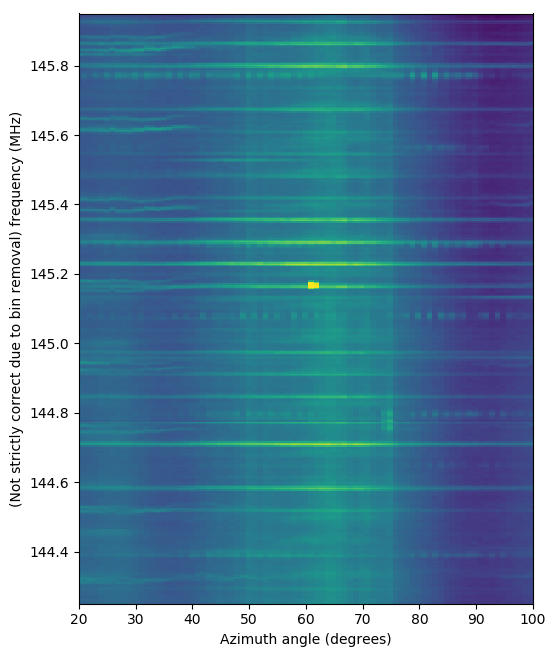
Filtering out the strong APRS and LA2VHF signals and rescaling the min/max ranges of the waterfall yields a better visualization over the other noise sources below:
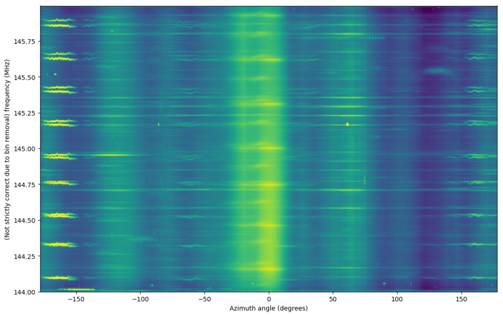
Here we can see various noise sources in different directions, nicely detailed and clear, almost like electromagnetic art you could hang on your wall. Features reminiscent of a switched mode power supply can be seen from 150 to -150 degrees azimuth, and again at around -75 to -50 degrees azimuth (possibly the same power supply, only modulated by the antenna pattern?), which have strong harmonics placed at many frequencies throughout our measured range. A large blanket of noise is seen at 0 degrees azimuth and -125 degrees azimuth.
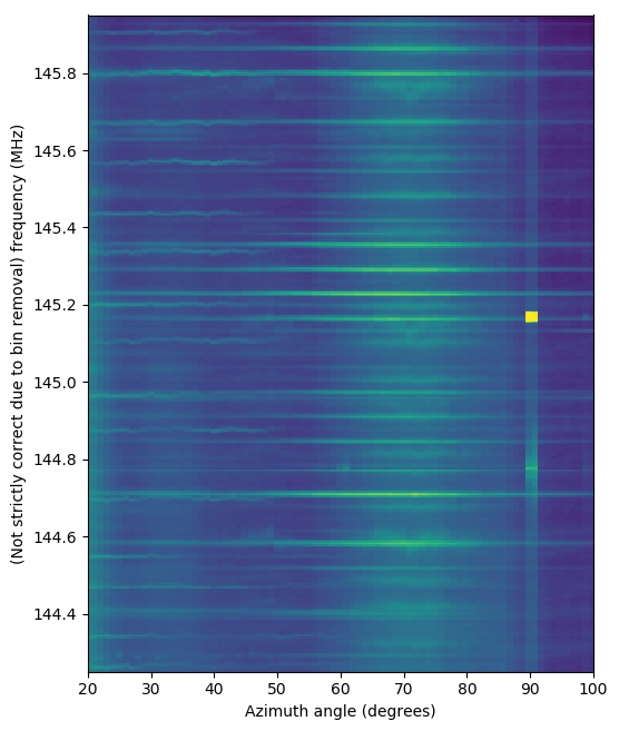
We took a measurement with the LNA turned on:
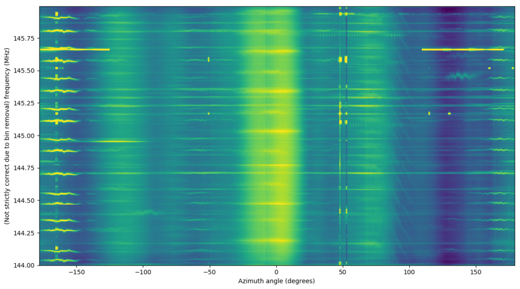
Features around 50 degrees azimuth are likely due to overflows during data acquisition. Long line from 100 to -150 degrees azimuth at 145.6 MHz is likely a repeater being opened. The waterfall is otherwise similar to the previous waterfall.
We also acquired one last dataset while having all electricity at ARK turned off, in order to see whether we caused any of the noise sources ourselves:
This result is more or less the same as when all electricity was turned on, except for being a few dB lower. One of the features that disappear are the following:
-
- Signals with ARK electricity turned on
-
- Signals with ARK electricity turned off
Weird dots disappear when we turn off the electricity. These are also probably some kind of SMPS, placed at ARK, but far from being as strong as the SMPS we could see towards the Vassfjellet direction. These noise sources are drowned out by the larger sources we see. (Note: Some of the features above seem to be shifted in azimuth angle from measurement to measurement, but this is probably just due to an overflow due to the high sample rate, and missed samples being propagated into a gap in the azimuth-sample correspondence.)
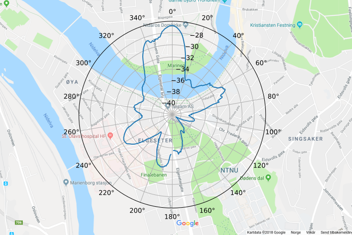
Integrated power over the frequency axis as a function of azimuth angle in a polar diagram:

Overlapping the pattern with a map over the central parts of Trondheim shows us where the noise might come from:
… however: since we only have one measurement from a single location, we don’t know the distance the noise has traveled. The noise might even be local and come from specific parts of Samfundet:

The noise might not even be in the specific local direction :-). These plots could be completely misleadning. LA3WUA has already been hunting noise with his antenna, and pinpointed a significant noise contribution from a fire system-related power supply. This power supply is located very close to the 2m array, in such a way that there are directions in which the power supply might be directly below the antenna. Conceptual illustration for an array with only one element:
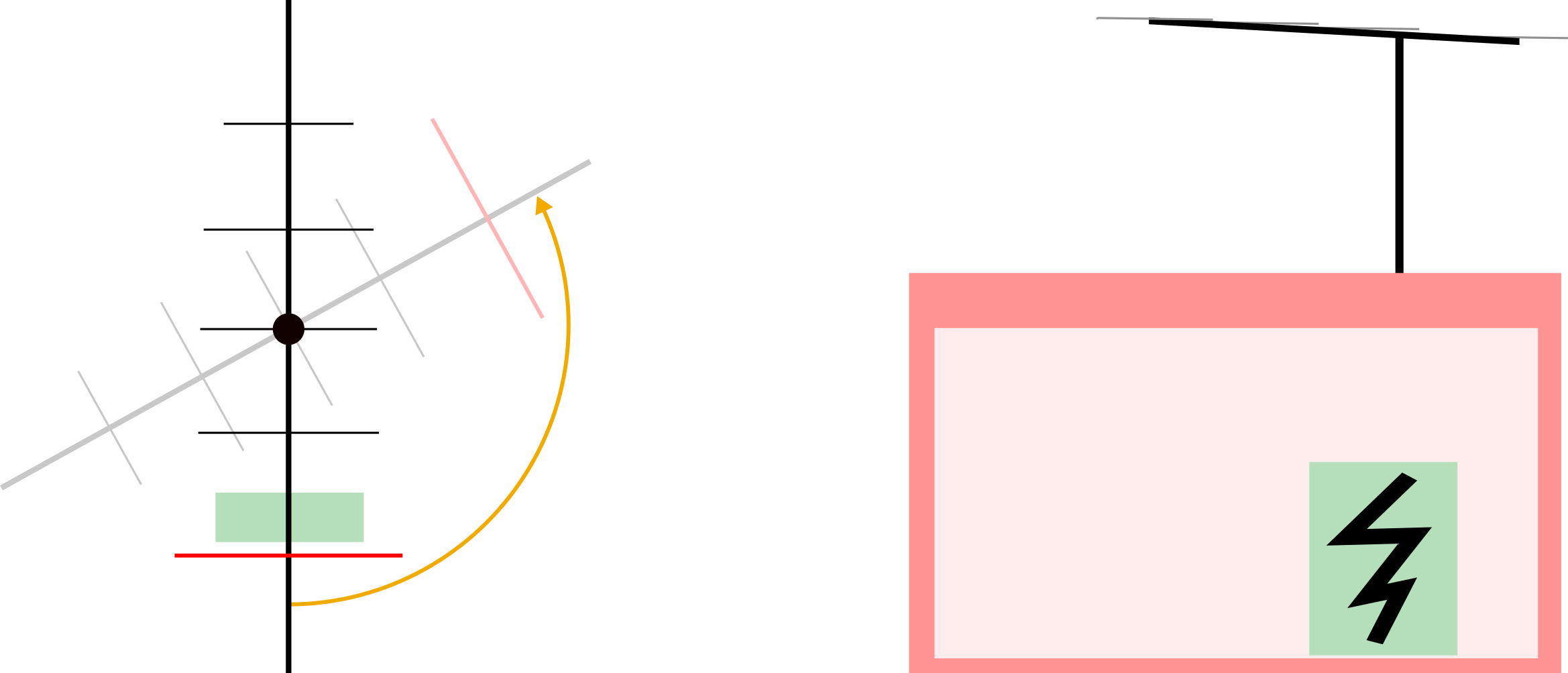
Left: Top-down view of antenna (black) with dipole element (red) and power supply (green), the antenna pointing towards to different directions and showing how it changes its distance to the noise source. Right: Side view of the setup.
Here, the power supply directly beneath the antenna array would be more close to the dipole element at some directions than others. In the antenna drawn above, the noise source would be the strongest with the antenna pointing towards the top of your screen. At other directions, the power supply would be weaker and modulated by the antenna pattern. We strongly suspect that this is the case with the noise ghosts at -150 and 0 degrees azimuth, and maybe even all of the strong SMPS noise sources we see in our diagrams. It will be exciting to see if this behavior changes if are able to eliminate this noise source.
In any case, the methods here are nice for visualizing signal sources in a larger frequency range. They don’t show how far away these sources are. For that we would need measurements on multiple sites, but we can pinpoint the general direction – as long as the source isn’t located directly beneath the antenna in question, as we suspect in our setup.


Leave a Reply