This years FD is history already and we had time to relax and to think about the propagation this year. The author joined the club back in 2012 and remembers vividly operating his first FD up North. Back then, loads of QSOs were made, 20m was wide open and the sun was shining. 🙂 But detailed memories start to fade, and you just have that feeling that the rate isn’t any longer as high as it used to be. 20m on Saturday 01/09-2018 felt particularly bad. Good that we have access to our old logs and can dig a bit into the data to see if everything was better in former times. 😉

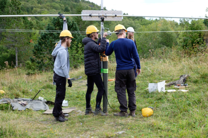
Mounting the 20m Yagi antenna on a portable mast the comfortable way anno 2012.
A library called PyQSO for our favourite scripting language allows us to read ADIF logs in an easy fashion. After a bit of scripting we get a nice bar chart showing the total number of QSOs with details about the bands.
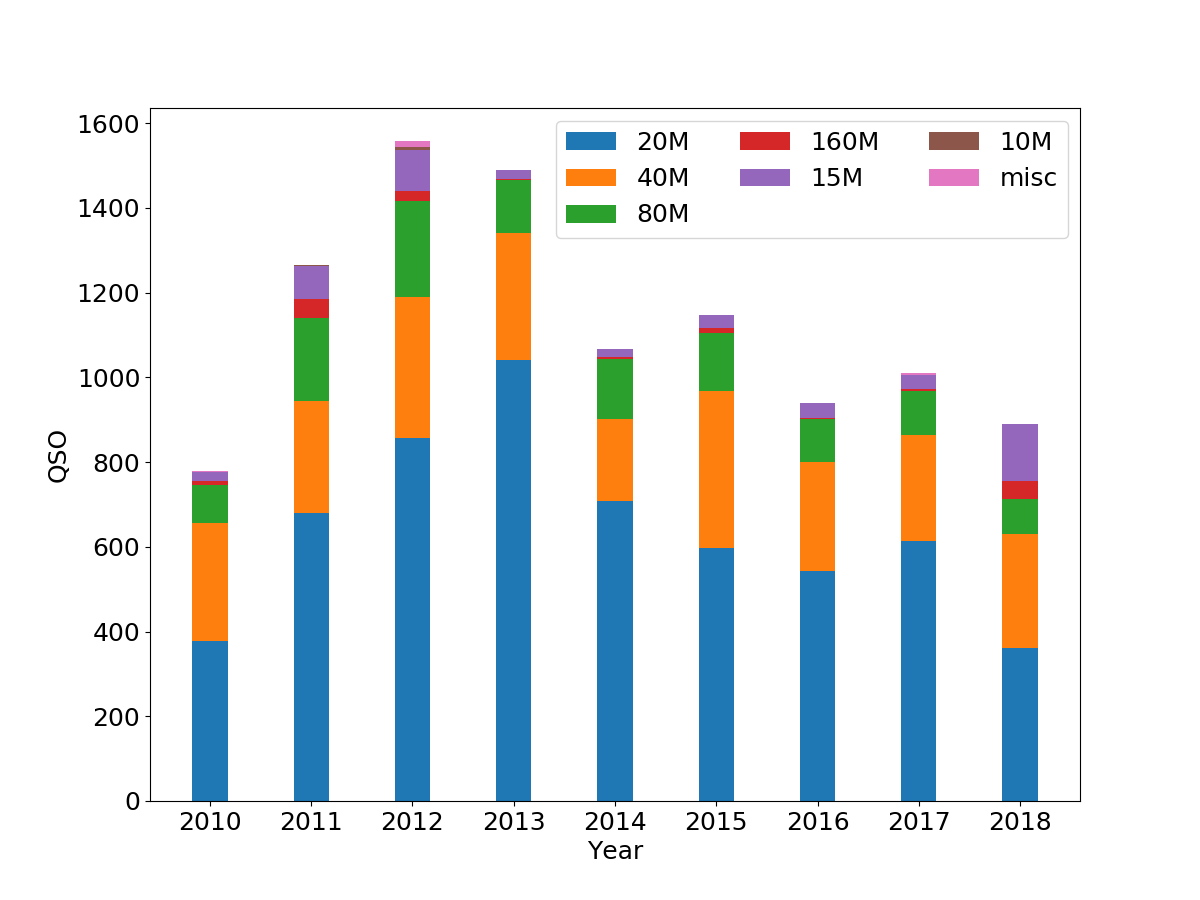
Band distribution of QSOs per year
We have always had the understanding that 20m and 40m are the dominating bands from here in Norway. Mostly due to propagation down to central Europe, with the large radio amateur populations in e.g. DL, I and G*. The graph shows clearly that 20m dominates the overall result. Back in 2013, more QSOs were done on 20m than the total scores since 2016! The QSO numbers on 40m seem to be mostly stable over the years. Surprising is the fact that 15m QSOs were adding a good lot to this years result, topping even the the contribution back in 2012. In addition, we have to consider different QTHs throughout the years, changing solar activity, and probably changing participation. Although a quick check of the result list of DL and G revealed a more or less constant number of participants submitting a log.
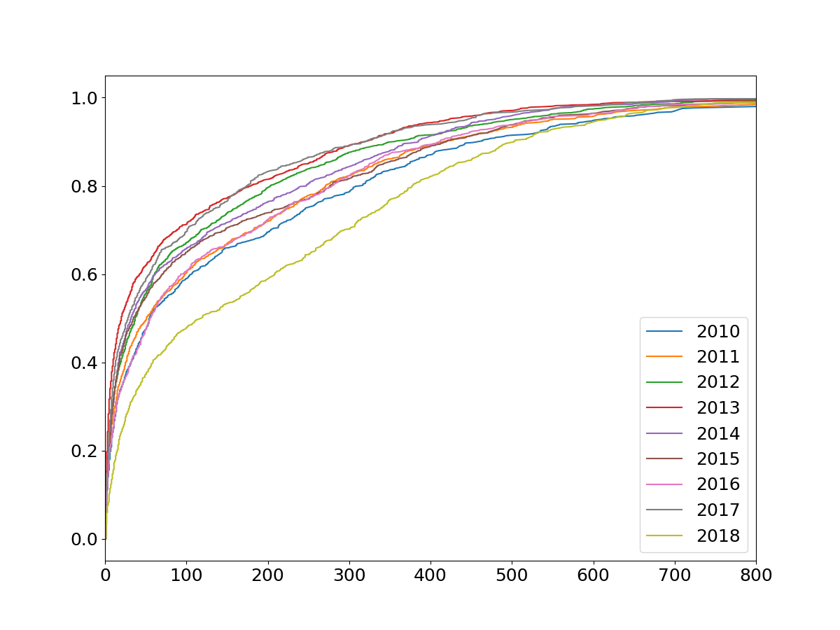
Cumulative density functions of received serial numbers
An additional insight into the progress of a contest can be gained by looking at a cumulative density function of the received serial numbers. It shows the distribution of received numbers and we can deduct that more then 50 % of our QSO partners send numbers below 50. This indicates that we are interesting for casual participants tuning the band only for a QSO or two. The slightly different distribution for 2018 can be understood by looking at the next plot. Since Saturday was much slower then usual, more contacts were done later in the contest. This changes the distribution slightly towards higher numbers.
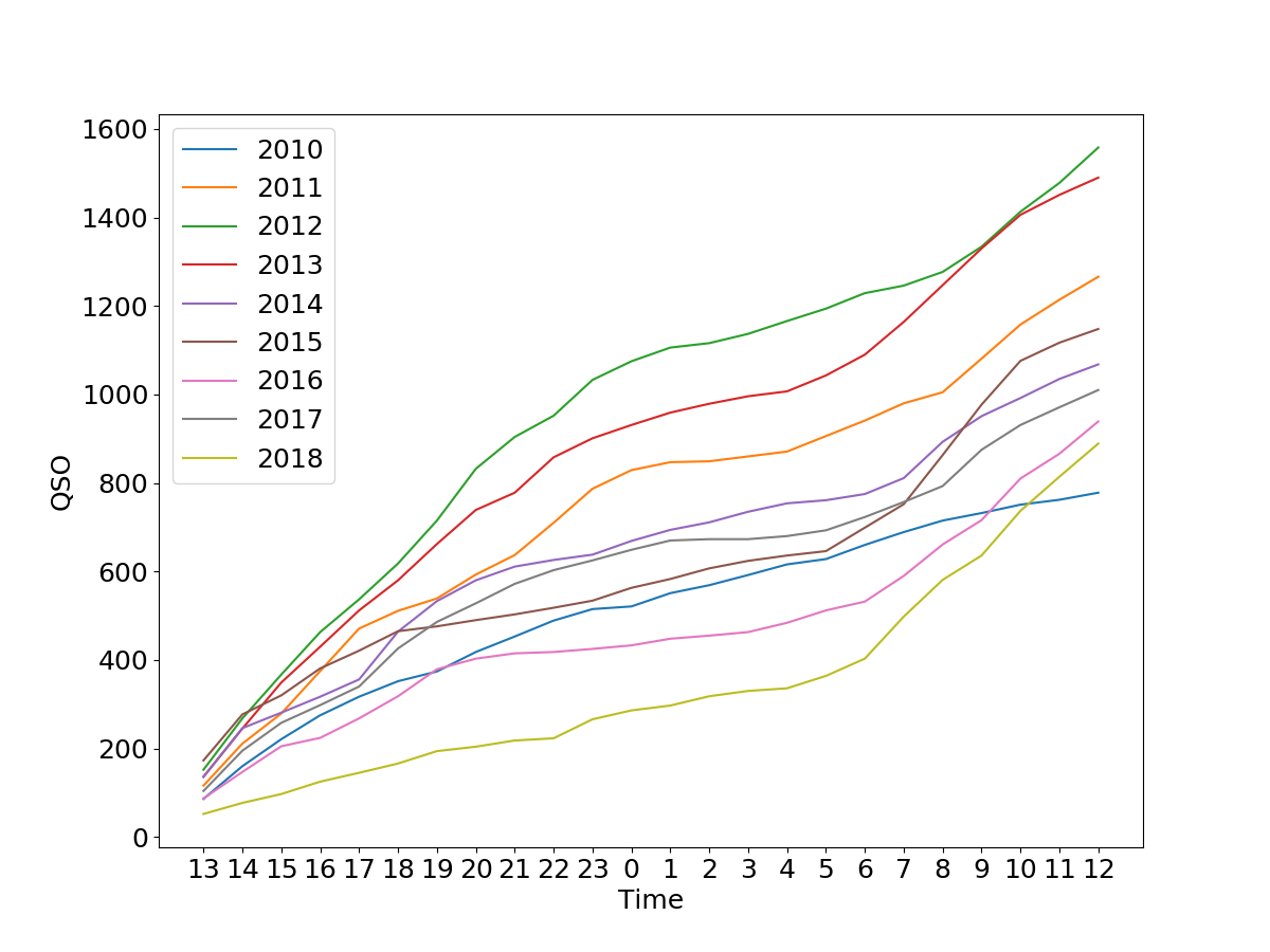
Sunday was more usual again and we finally surpassed the result from 2010 around 10z. A cumulative QSOs vs time plot can be particularly helpful to track progress during a contest. We would have been reassured that something was considerably different this year if we have had the plot at hand.
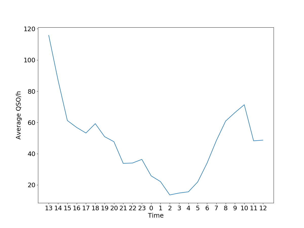
Finally we are coming back to the question in the headline: Where is the rate? All the data from the logs was used to calculate the average rate of QSOs per hour vs time. We see that the first two hours have been the most busy of the whole contest. Hence, the first take home lesson is: Don’t start late! This becomes even more evident if you want to be there when the casual participants switch on their radios. 😉 Further, we see a slight increase around 18z which might just be the hour after dinner for some or the time 40m becomes easier accessible.
The rate is quite slow throughout most of the night and has dropped below 20 QSOs per hour between 02z and 05z. Please remember that we have the possibility to run on 40m and 80m at that time and NRRL FD rules even permit to work people on 160m. The sun is rising around 4z for us and we observe that the average rate is steadily increasing until 10z sharply dropping for the last two hours of the contest. Most people might just disappear for lunch or start packing down early? The rate distribution is supporting the observation that 20m is a major contribution for us as we see higher rates during European daytime.
In summery, we have found that the rate belongs to the early bird and therefore it is worthwhile to start on time! In addition, there might be some surprises in terms of propagation out there even in slow years. 🙂

Leave a Reply